The Best Squarespace Fonts for an Elegant Website
I went through every single font in Squarespace so you don’t have to. When you’re trying to pick out the best font for your site, it can be challenging. So, if you are looking for an elegant font to level up your Squarespace website, this is the blog for you.
Here are my top 10 Font combinations for an elegant website.
Then below, I listed the best fonts to use as a Header and the best to use for the paragraphs font so you can mix and match your own favorite font combination.
1.
I love this fun yet sophisticated combination. Jeanne Moderno definitely brings some flair to this elegant pairing. Combined with the understated sans serif font, Gaultier lights, it is perfectly balanced.
2.
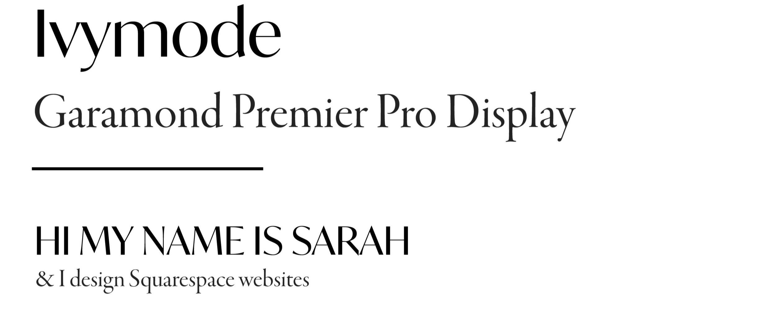
Ivymode is one of my favorite fonts. It is simple and minimalist with nuanced style. To emphasize its elegance, try writing headlines in all caps. Paired with a classic, Garamond Premier Pro Display, your website will be classy as can be.
3.
Contralto Big is like Ivymode’s older sister. Slightly bolder, it still very much classifies as elegant. It is paired with Aux Next for a beautiful contrast in styles.
4.
They don’t call it “Grand” for nothing". As stunning as this font is, I would caution against overusing it. When overdone, it can come off as pretentious or indiscreet. With a font as grandiose as Filosofia Grand, it must be paired with something simple and inviting. Gaultier lights does the trick. Gaultier lights is extremely versatile and can be paired with almost any font.
5.
Turquoise has a bit more personality than others on this list. Somewhat deco, I debated if it could make this list. Done well, Turquoise can most definitely be an elegant font. It must be paired with the right palette, copy, and other web elements in order to achieve an elegant style. Paired with Mr. Eaves Sans, it is perfectly balanced.
6.
Another one of my favorite pairings. Operetta is a stately serif font. There are many other Operetta varieties but 32 is my favorite. Paired with a styled sans serif, this combo is the epitome of elegance. Utile display can definitely be a Header font as well.
7.
Another bold combination; Retiro std with Hypatia Sans Pro. This pairing has some personality but with the right offer and surrounding web elements, it will offer added elegance to your website.
8.
This is the last deco-style font combo of the list. Questa Grande is bold and intriguing. Paired with a robotic font, Interface, it will give your website visual interest while maintaining your elegant style.
9.
Fino is a gorgeous, stately font. But like Filosofia Grand, it can be overdone. Use this font for Headers 1 and 2 for instant elegance. It pairs nicely with Adobe Jenson Pro Display but could also pair well with a sans serif like Gaultier lights or Aux Next.
10.
A double styled sans serif combo can be overbearing if not chosen carefully. But, this curated combo is as elegant as can be. With an almost monotone mood, it is understated yet intriguing. An uncommon combination, this pairing will set your brand apart.
DIY YOUR FONT PAIRING:
HEADER FONTS:
Pick one of the fonts below to use for your headers.
PARAGRAPH FONTS
Next, pick your paragraph font to pair with your header.
WANT TO SEE MORE FONT COMBOS? SEND YOUR REQUESTS TO sarah@magdalenedesignco.com
My name is Sarah and I’m your gal for tips about Squarespace and Nonprofit Websites & Marketing.
Interested in Custom Web Design? Schedule a consult call here.


