The Best Squarespace Font Pairings 2022
14 fonts that will make your website look like it was designed by a pro.
What makes a font pairing good?
As a rule of thumb, a good font pairing will balance each other out. If you have a serif heading font, you will likely want a sans serif paragraph font. It also depends on your brand and what feeling you want your website to give off. If you have a clean, minimal brand, you may want two sans serif fonts for the header and paragraph fonts.
In summary, a good font pairing will do two things:
Balance each other out
Aid the overall brand feel
The 14 Best Font Pairings on Squarespace
IvyPresto Display + Montserrat
This is an elegant font pairing. IvyPresto is a gorgeous editorial font while Montserrat is a modern and minimal font. A perfect pairing if you want to achieve a high-end, sophisticated feel for your brand.
2. Lora & Raleway
Lora is an approachable font. Paired with Raleway, this pairing is balanced and professional but less exclusive than the IvyPresto + Montserrat duo.
3.) LTTC Bodoni 175 + Proxima Nova
Bodoni is a sophisticated serif while Proxima Nova is as minimal as it gets and is almost futuristic. A paradoxical pairing, these two fonts give off the feel of elegant pragmatism. A great font pairing for service providers - copywriters, designers, artists etc.
4. Contralto Big + Agenda
Aptly named, Contralto Big is a sans serif with a big personality. Agenda is delicate and nicely balances the bold, slightly retro Contralto. This font pairing would be great for interior designers, law firms, and other professional services.
5.) Garamond Premier Pro Display + Acumin Pro
Garamond is a staple. Premier Pro Display takes it up another notch, creating a more refined feel. Similar to Proxima Nova, Acumin Pro is minimal and approachable.
6.) Abril Display + Adrianna
Abril Display has more intense ligatures than the previous headers and would fit a feminine brand well. Adrianna is a sans serif with slightly more personality than some of the above paragraph fonts. This pairing is welcoming, feminine, and still very professional.
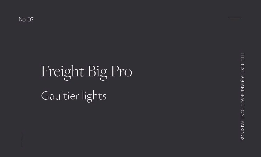
7. Freight Big Pro + Gaultier lights
Another elegant font pairing. Freight Big Pro’s elegance is enhanced when you drop the weight down to 300. Gaultier is a warm sans serif that balances out the delicacy of Freight Big Pro.
8. Utopia Stf Display + Freight Sans Condensed Pro
A friendly font, Utopia Std Display pairs nicely with Freight Sans Condensed to achieve a more professional, clean feel. This pairing is great for service providers.
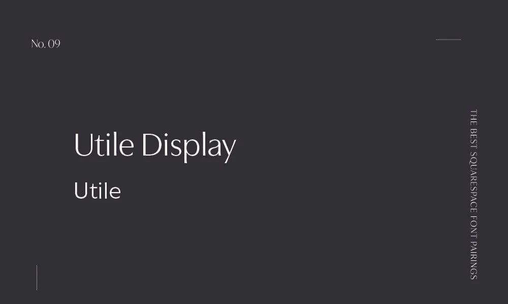
9. Utile Display + Utile
A very simple yet elegant pairing. Clean and easy to read, these fonts are perfect if your ideal audience has no time for fluff.
10. Operetta 12 + Brandon Grotesque
Operetta is reminiscent of a time gone by but is still modern. Especially when paired with Brandon Grotesque. Brandon Grotesque softens the edges of Operetta with its simple and innocent feel.
11. Lavigne Display + Europa
I love this font pairing. I’m a sucker for a good editorial font and Lavigne fits the bill perfectly. A warm editorial font, paired with Europa, it is professional but inviting.
12. Minerva Modern
A modern pairing. This combination is perfect for a brand that wants a high-end, minimal feel.
13. Ivymode + Roma
Similar to Minerva + Poppins but this combo kicks it up a notch. Roma is less robust than Poppins and this delicate paragraph font enhances the elegance of the pairing.
14. Essonnes Display + Ainslie Sans
Last but not least, Essonnes is another fancy serif with accessory ligatures. This combo gives off a refined but pragmatic feel.
Did I miss any? Send me a message at sarah@magdalenedesignco.com
My name is Sarah and I help photographers, coaches, & therapists grow their businesses with strategic Squarespace websites


